All-in-One Solution for Comprehensive Vehicle Management
In collaboration with Carbang, South Korea's pioneering online platform for vehicle ownership transfers, our redesign project reimagined how users interact with the app. Moving beyond a sole focus on registration transfers, we aimed to create a comprehensive and user-centered experience that caters to ongoing vehicle management. This entailed restructuring Carbang's business model to introduce additional features, such as streamlined insurance information and full-service vehicle support.
Client
Carbang
Team
1x Product Manager
1x Product Designer
1x Full Stack Developer
1x Backend Developer
My role
Product Design and management
Year
June — August 2023
Background
Carbang is South Korea's first online platform for vehicle ownership transfer, offering a groundbreaking solution for managing vehicle-related processes. This app allows users to complete ownership transfers, access vehicle history, and retrieve critical vehicle-related insights directly from their mobile phones. In addition to its core feature, Carbang offers services like vehicle analysis, history reports, and real-time updates on ownership status and restrictions.
The primary objective of this redesign project was to improve and expand the app's user experience beyond its main function of "online ownership transfer." During the kick-off meeting, the Carbang team aimed to tackle issues related to expanding the user base and enhancing the app's engagement. The meeting discussions identified two key areas for improvement: the "Insurance Accident History" and "Vehicle Analysis" pages, both of which required redesigns to better meet user needs and expectations.
My role in this project, therefore, involved rethinking these interfaces to make the information hierarchy more intuitive and provide a clearer visual structure that enhances usability. The discussions during the kick-off also focused on determining the priorities of each of the app's main vehicle management features and simplifying user processes such as registration and ownership verification.
Problem & Finding
In the Problem & Finding section, we identified several common pain points from analyzing domestic and international vehicle and insurance applications. These include:
- Lengthy and complex sign-up processes
Users often face frustration due to multiple steps and time-consuming registration procedures. - Difficulty with technical jargon
The use of specialized terms can be confusing, especially for users unfamiliar with industry-specific language. - Lack of personalized experiences
Many apps do not provide sufficient personalization features, leading to a less engaging and tailored user experience.
These insights formed the basis of the pain points that we aimed to address in our redesign approach for the Carbang platform.
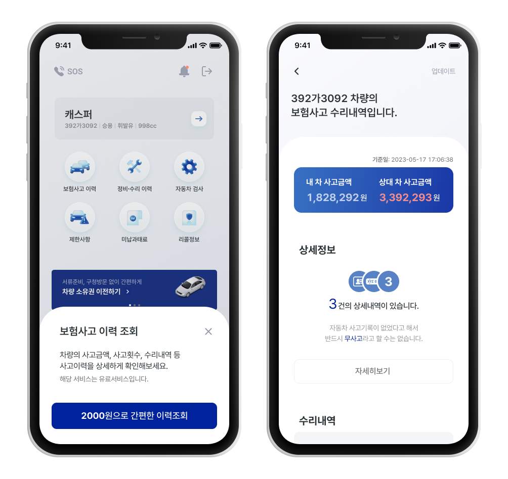
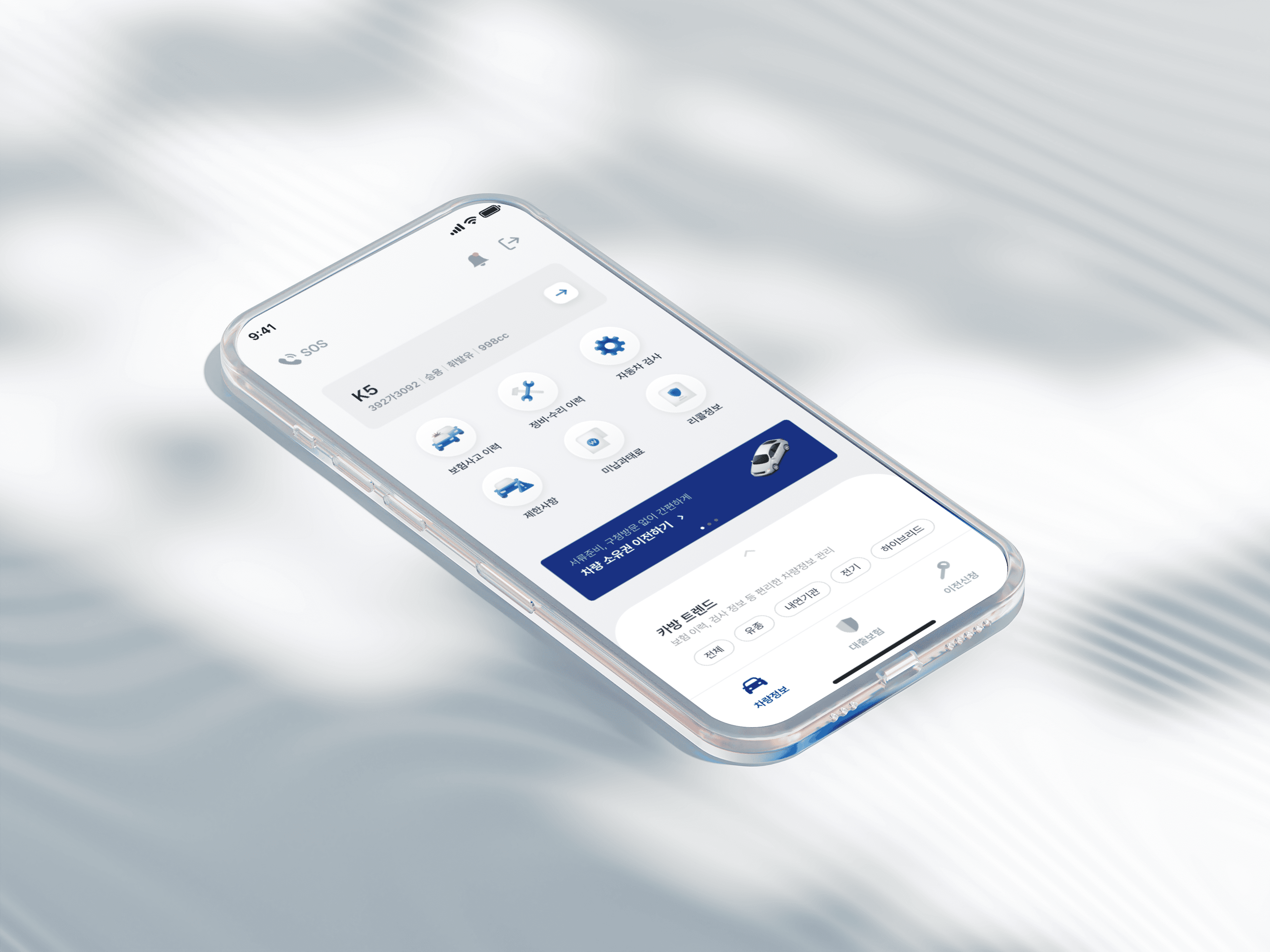
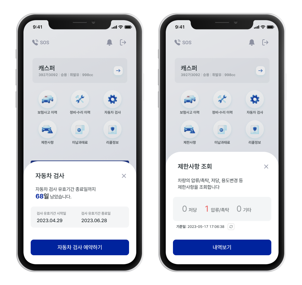
Main Feature Prioritization
In the redesigned interface, the main feature, "Insurance Accident History Check," was prioritized at the forefront, ensuring user accessibility and emphasizing its status as a paid service.
To enhance usability, a consistent and user-friendly design language was applied, focusing on high-visibility components for improved interaction. The key details were highlighted using icons and main colors, with a refined text hierarchy that maintained a clear, non-intrusive presentation, making essential information easily recognizable and actionable for users.
Emphasize Legibility
To simplify the understanding of vehicle-related information, my proposed solution ensures that even users without background knowledge can easily grasp essential details. Using sub-descriptions,
I clarified terms like "restrictions" in a user-friendly manner, making it easier to interpret key information. Additionally, I highlighted expiring information with intuitive visuals, reducing cognitive load and allowing users to comprehend technical data seamlessly. This approach incorporated UX writing and content structuring to convey professional vehicle details effortlessly.
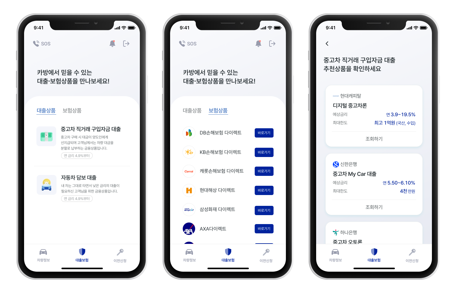
Seamless Insurance Integration
Expanding business to offer an all-in-one vehicle management service with personalized insurance recommendations suited to each user’s unique needs.
The interface follows the tone and manner of financial and insurance benchmarks, prioritizing simplicity and clarity to communicate information as effectively as possible.
Enhance Branding
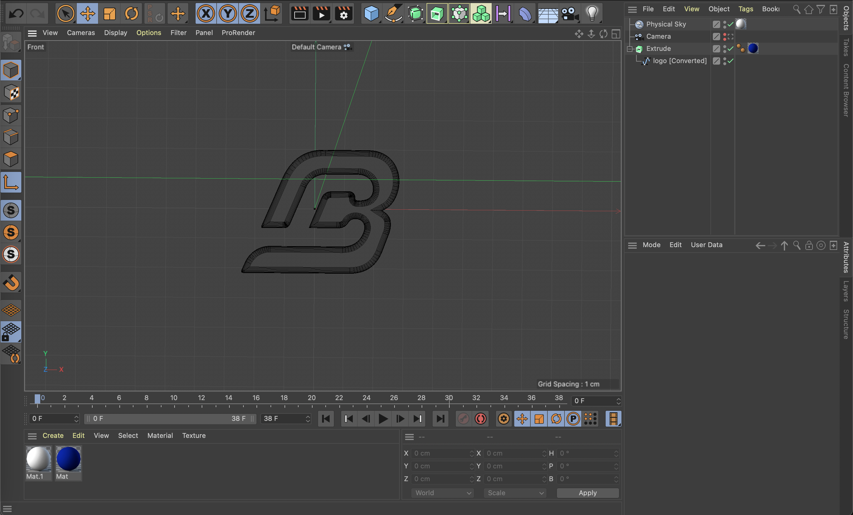
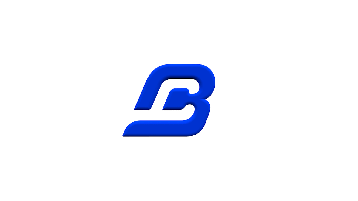
The branding efforts for this project focused on transforming the app’s visual identity to better reflect its role in vehicle management and to reinforce trustworthiness. The original light-blue logo lacked contrast and didn’t effectively communicate the app’s reliability or its focus on vehicle care. To address this, I adopted a deeper blue palette, symbolizing stability and trust, which aligned more closely with the core values of vehicle management.
To further enhance brand consistency, I transitioned from open-source icons, illustrations, and loading images to fully customized assets. This included a Cinema4D-rendered logo with a rotating effect, which was implemented as the loading animation. This not only provided a cohesive look across all visual touchpoints but also reinforced a professional, high-quality brand presence across the app's interface.
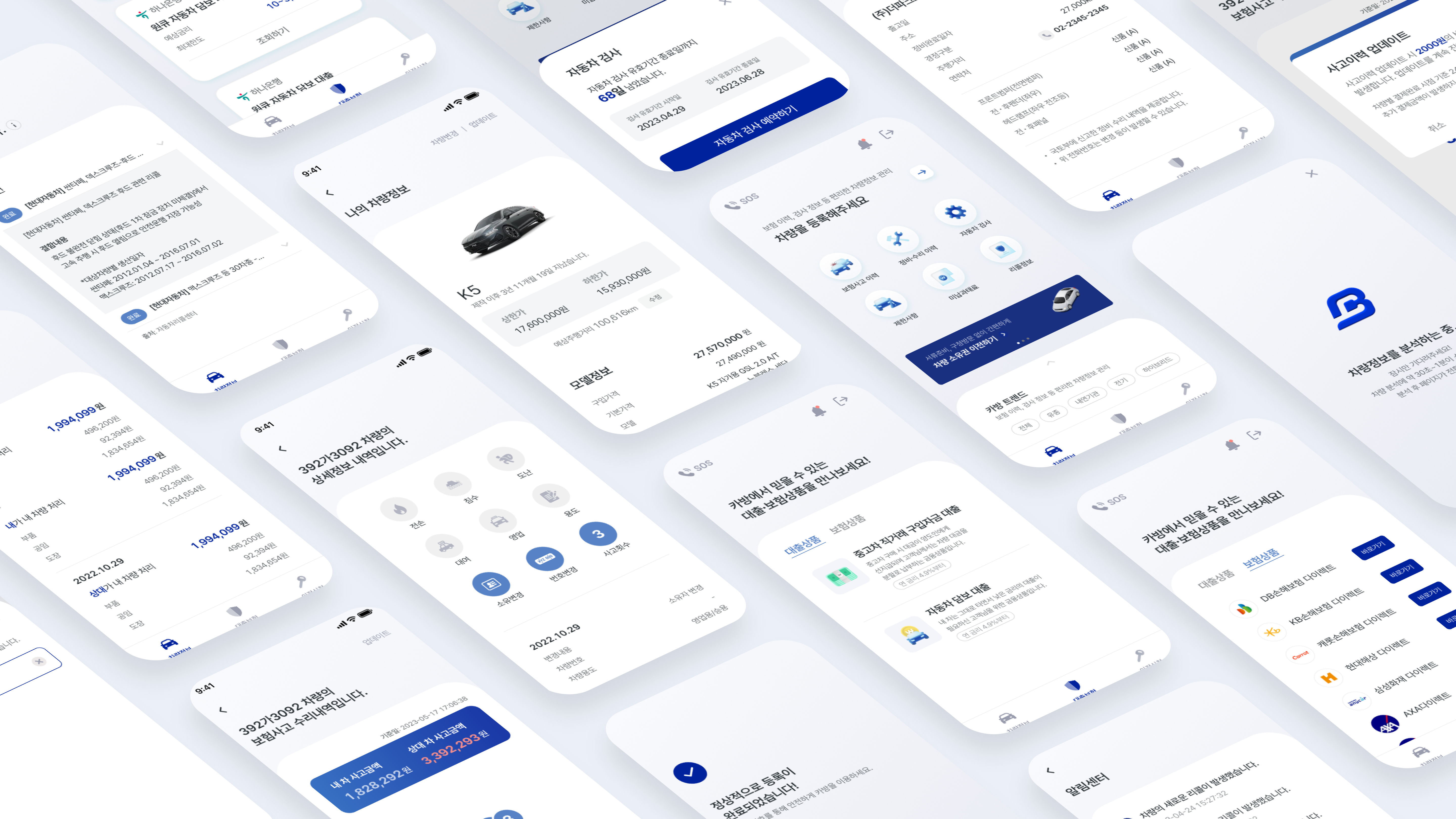
Result
After the app’s launch, branding enhancements effectively strengthened the app’s market presence, allowing for a full website redesign aligned with this refreshed brand identity. Successfully published on both the App Store and Google Play, the app’s strategy evolved beyond simple vehicle transfer services, aiming toward a comprehensive, long-term vehicle management solution. This expansion aimed to cultivate a loyal user base, with features designed to support all facets of vehicle ownership, thereby positioning the app as an all-in-one management platform for drivers.